

VAPS
The objective of the project is to develop a prototype for an online visual analytics application. To achieve this goal, the project focuses on creating dashboards using Microsoft Power BI. These dashboards facilitate interactive and visual connections between various datasets, such as process data and segment data. To enhance user engagement, the project also devises innovative interaction concepts and generates user-specific visualizations. A pivotal aspect of this endeavor involves conducting statistical analyses based on an existing dataset. By leveraging the available data, the project aims to derive meaningful insights through data analysis. This approach not only aids in uncovering patterns and trends but also guides the development of effective visualization strategies within the Power BI dashboards.
The ultimate aim is to empower users to intuitively explore and comprehend complex data relationships and trends. The utilization of Microsoft Power BI as the platform for this prototype underscores its capability to provide a seamless and user-friendly environment for data visualization and exploration. The development of interactive dashboards aligns with the overarching objective of offering a dynamic and engaging experience to users. By customizing visualizations to cater to user preferences and needs, the project seeks to elevate the effectiveness and relevance of the analytics application.
In summary, the project's core mission is to construct a prototype for an online visual analytics application. This is achieved by crafting interactive dashboards using Microsoft Power BI, which facilitate visual exploration and interaction with diverse datasets. Through data analysis, statistical evaluations, and the creation of tailored visualizations, the project aims to empower users with valuable insights and a user-centric analytics experience.
Goals
Use Case 1 (BU Band)
The primary objective is to construct a prototype for an online visual analytics application. Dashboards within Microsoft Power BI facilitates interactive exploration, connecting process data with segment data. To achieve this, interaction models, user-specific visualizations, and statistical analyses based on existing data are developed. Key exploration areas include replacing current analysis tools, linking errors to process data, defect identification on coils, statistical defect cause analysis, and expediting analysis through visual data analysis and direct database connectivity.
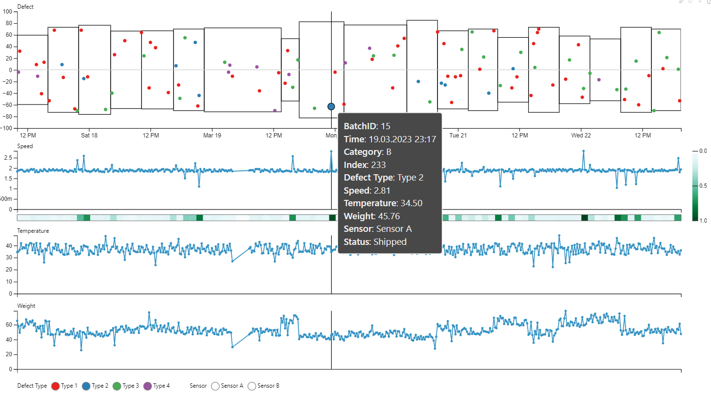
Use Case 2 (BU Bramme)
This scenario focuses on interactive projection data visualization to identify variables influencing fault types. Microsoft Power BI is used to create both interactive and static dashboards. The goals encompass unifying reporting architecture, visualizing defects on slabs through projection, analyzing influencing factors of defect types like OZE, and representing work processes interactively using resource time scales.
Use Case 3 (Consulting): This case entails consulting services to aid in selecting appropriate visualization types. Expertise in perception-optimized design and data preparation is shared to enhance visualization effectiveness. Collectively, these use cases drive the creation of an innovative online visual analytics framework, improving data interpretation, analysis efficiency, and decision-making processes.
Approach
The project methodology is based on a systematic approach that seamlessly combines technical expertise and strategic understanding. It starts with the initial pre-project phase, where we gather all the necessary requirements. This initial phase sets the tone for subsequent phases, which include project kick-off meetings, extensive research analysis, joint co-design, iterative feedback and refinement loops, and finally preparation for launch. The development concludes in the final operational phase, where the dashboards created are used by the end users and embody the collective essence of the whole process.
Expected and Achieved Results
Use Case 1 (BU Band)
- Successfully delivered 4 use cases
- Created dashboards for an overview on warehouse capacities and material flow
-Created custom Power BI visual for quick analysis and comparison of hundreds of parameters
Use Case 2 (BU Bramme)
- Successfully delivered 4 use cases
- Publication of custom visual for efficiently comparing multiple parameters over a common axis on Microsoft AppSource (https://tinyurl.com/t6xmya92)
- Created three custom visuals tailored to the needs of end users
Use Case 3 (consulting)
- Successfully created design process guidelines for dashboard and provided consultation to several departments